Logging In
To Log In you'll need to use the same Email associated with your Control Center login.
Once Logged In, you'll be redirected to the landing page where all of your existing OTT Applications.
Visual Application Editor
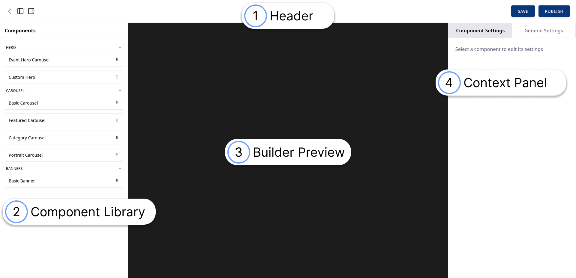
The Builder is arranged in four separate sections:
- Application Header
- Component Library
- Builder Preview
- Context Panel
The Header
The header provides a way to hide the Component and Context Panels as well as buttons for Saving your layout and Publishing your Application.
Remember to Save your progress after you alter your OTT Application.
If you refresh the page or navigate away your changes will be lost if you don't click the Save button.
Builder Preview
Before we touch on the Context and Components Library it's best to understand how you can interact with the Builder.
When you create a brand new OTT Application we pre-populate it with a few basic components to get your started: A "Basic Banner" component as well as a "Basic Carousel".
Editing or Removing Existing Components
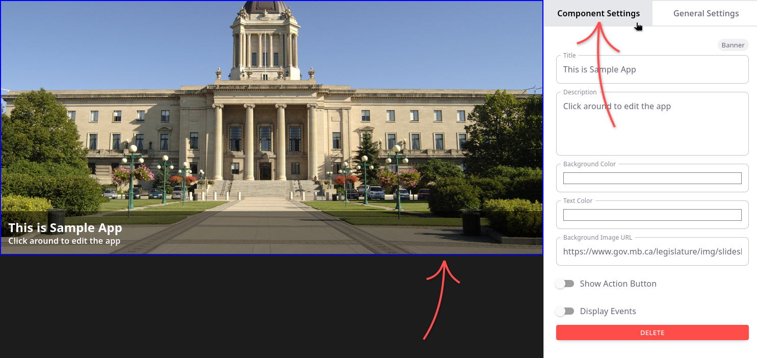
To edit the properties of either of these default Components (or Remove them from the preview), all you have to do is Left-Click on them once which will bring them into the Context Bar.
*You can only select one Component at a time (we don't support selecting multiple for batch actions like multiple Remove/Delete
Rearranging Components
All components withing the Visual Builder support "Drag-and-drop" functionality. You can Left-click + hold and drag the components above/below other components
Resizing
Only the Heroes and the Banner can be resized vertically.
To do so, put your cursor over the Top or Bottom border, then Left-click hold + drag up/down.
A note on resizing the Basic Banner:
When "Event Carousel" mode is selected for the Banner, sometimes resizing a Banner too quickly will result in the background opacity to show a small empty section above it. To fix this, left-click + hold / drag the bottom of the banner slowly toward the top.
Context Panel
The context panel is used to bring up all the actions available for the currently selected component.
To bring up the Context Panel: Single Left-click any component once. When you select a component that has been dragged into the Builder Preview, a blue border will show that it is the selected one and immediately show the available actions in the Context Panel within the Component Settings tab.