Component Library
The Component Library is broken up into "Heroes," "Carousels," and "Banners".
Heroes
"Hero" is a word used in Web Interface Design which - as the name suggests - is the "champion" of your Application's Branding. The Hero calls attention to itself and typically is what the end user is intended to see first when they visit your application.
Our OTT Builder provides two Hero variants:
- The Custom Hero
- The Event Hero Carousel
The Event Hero Carousel
By default this component will fetch a List of your Events of all Categories and any Event Status from the past 2 years; you
will have to refine what you want it to display through the Component's "Context Panel".
Below are the descriptions of each available context action within the Event Hero Carousel:
Show Active Item Indicator
- When the list of Events retrieved has 1 or more results, a small Active Item Indicator bar will appear at the bottom of the component showing which item in the list is active.

Search Filters
Categories
- Clicking on this will list your Account's available categories. Selecting one will refetch the list of Events and display the results. You can select multiple Categories by using
ctl + left click.
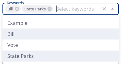
Keywords
- Behaves the same way as the Categories does, but fetches on your Event's assigned Keywords instead. You can select multiple Keywords by using
ctl + left click.
Start and End Date
- By default the Start and Stop dates are empty and the Carousel will fetch no more than 8 Events from your Account going back 2 years.
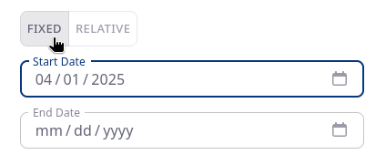
Some notes on "Fixed" vs. "Relative" Start and End dates:
By default the "Fixed" option is selected. Fixed dates can either be:
- Only Start Date selected - list Events back to some certain up to "now"
- Only End Date selected - list Events up to the specified date
- Both Start and End Date selected - list all Events between two fixed dates
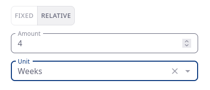
The "Relative" Date selector will always be relative to the current Date.
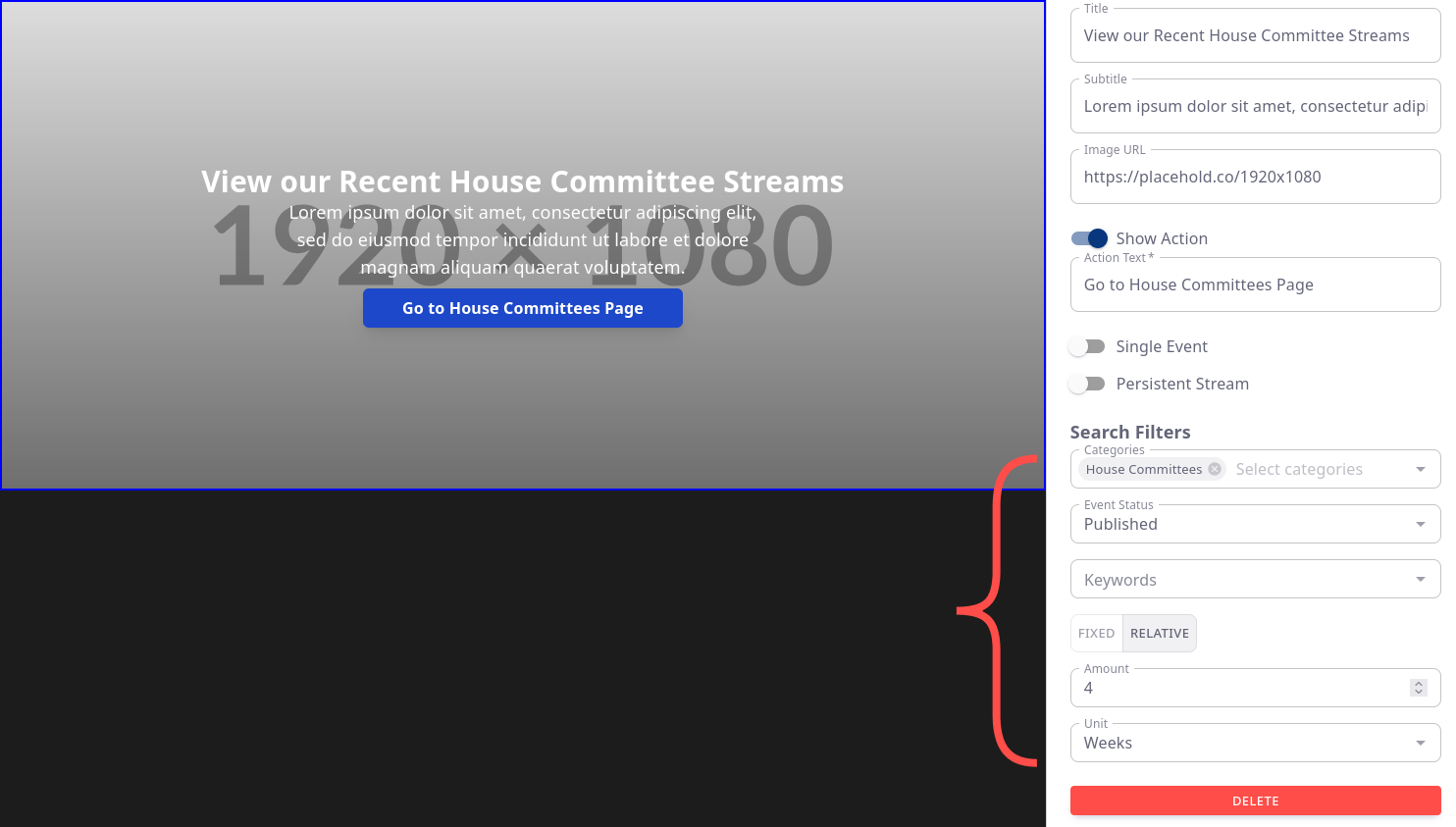
In the Example below, you can interpret the values to mean:
- "Fetch Events from the previous 4 Weeks"
Gotcha:
For every Event list fetched regardless of date range, only a maximum of 8 are returned at a time. This value cap is not configurable.
The Custom Hero
Unlike the Events Hero Carousel the Custom Hero is a static, single image backdrop with text overlay and an optional Action Button.
Image Background Best Practices
- In order to replace the background image (Linked URL) you may use your own server, but we recommend, for the sake of availability, to upload to your Account's Global Media Library.
That process would be:
- Go to your Global Media Library: controlcenter.invintusmedia.com/manage/media
- Upload the desired Image
- Once uploaded, click the "Download" button, Copy the URL you are redirected to then paste it into the Custom Hero's "Image URL" field
Custom Action
The Custom Action on your Hero can be thought of as a link to a nested page within your application. Currently it can serve three separate purposes:
- To show a Single Event (A use-case for this would be a direct link to recently published Documentary or other important Published Media)
- To show a Persistent Stream (These are your account's Persistent/Always-on 24x7 Streams if you have them setup)
- To show a list of Events using the Filters you assign
If neither the Single Event or the Persistent Stream are selected, the page the user is redirected to will act as its own Events List grid
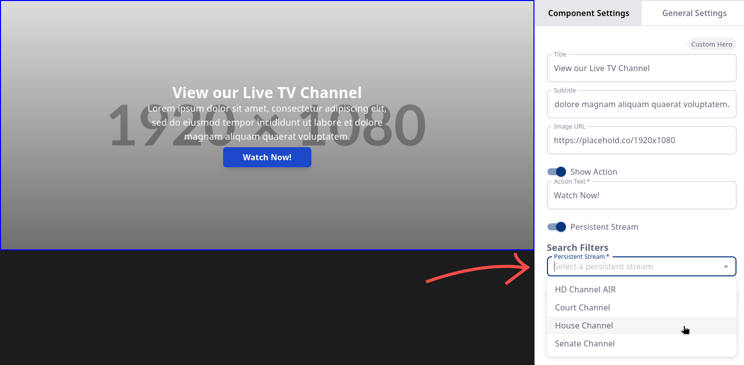
Below is an example of what a list of Events would look like for a category of "Supreme Court" (shown rendered on Amazon Fire TV)
Though our OTT Builder can't show you the preview of the Events List page, those pages can be thought of as a TV Shows Episode page as you might find on popular Streaming services.
These secondary pages inherit their page title from the Component Title
For instance, this secondary page came from a Category Carousel with a Carousel Title of "Supreme Court".
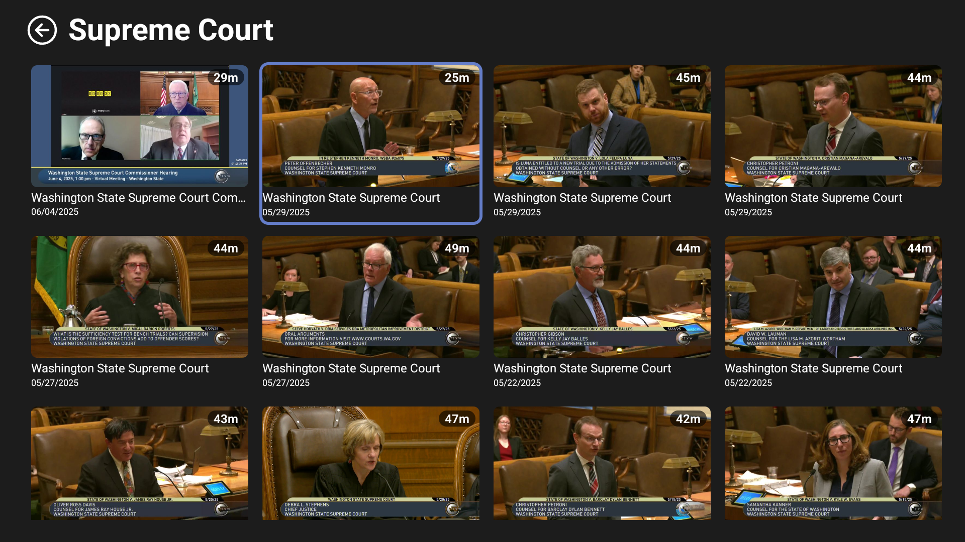
Single Event
The Single Event option is great for Events which you think should be given their own section in your App. These can include State of the State Addresses from the Governor, your own in-house Documentaries, or anything you see fit!
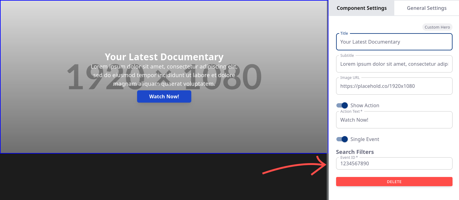
Persistent Streams
If you have set up a Persistent (24x7) Stream they will be selectable as shown below
Events List
This mode will provide a button which redirects the user within the OTT App to a discrete Events List page based upon the Search Filters you set.
Carousels
Carousels share much of the same functionality with the Heroes mentioned above, however all Carousels are tailored to show content in a Left-to-Right list format that cycles in a loop navigationally.
All Carousels are limited to fetching at most 8 videos from the Search API Endpoint. Currently this is not configurable.
Basic Carousel
The Basic Carousel functions as a List of Events and shares the same properties as the Event Hero but will show all matching Events in a Left-to-Right layout based on the Search query parameters you provide.
The Basic Carousel has three variants:
- Event List - This is the default mode and will match the query parameters you provide
- Most Watched - This populate from your Account's Most Watched videos as dictated by the end-user analytics.
- Persistent (24x7) Streams Carousel - For Clients who have multiple Persistent Streams they can list them here.
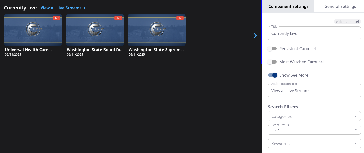
Event List Carousel - Example
Shown below is how you can configure the default Basic Carousel to show your currently Live Events
Most Watched Carousel - Example
To make the Basic Carousel a "Most Watched" Event's list, all you have to do is toggle on the "Most Watched Carousel" option.

Persistent (24x7) Streams Carousel - Example
Toggle on the "Persistent Carousel" option to make the Basic Carousel into one dedicated to Persistent Streams. Like the other multiple select dropdowns in the context bar, you can select multiple 24x7 streams with ctl + left-click

Featured Carousel
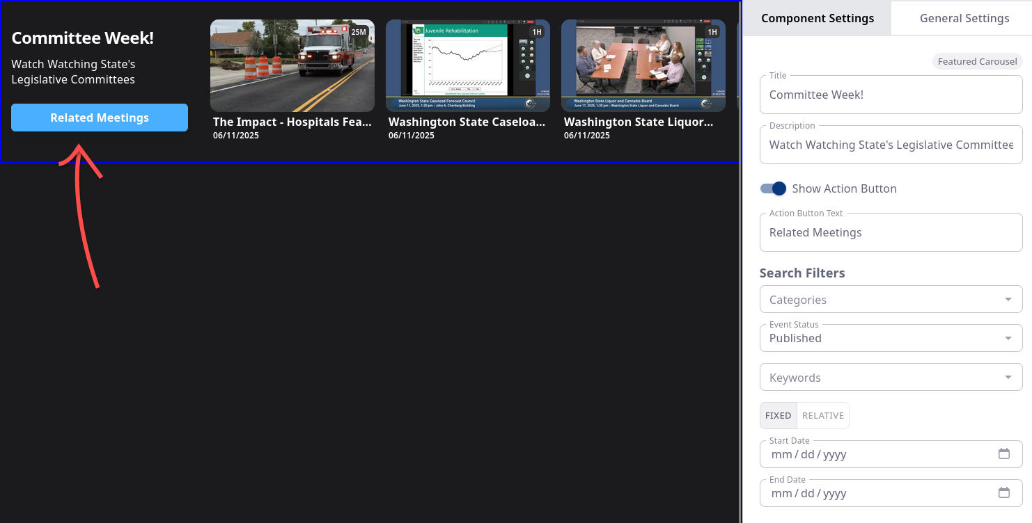
This differs from the Basic Carousel in that it provides a more prominent visual callout with its own dedicated space in listing of Events.
A few gotchas about the Featured Carousel:
- Intended to draw attention to the list more prominently than what the Basic Carousel can offer
- Does not support listing Persistent Streams
- Does not support "Most Watched"
Category Carousel
This is a special Carousel intended to list links to discrete pages of Categories of Events - it does not list Events themselves.
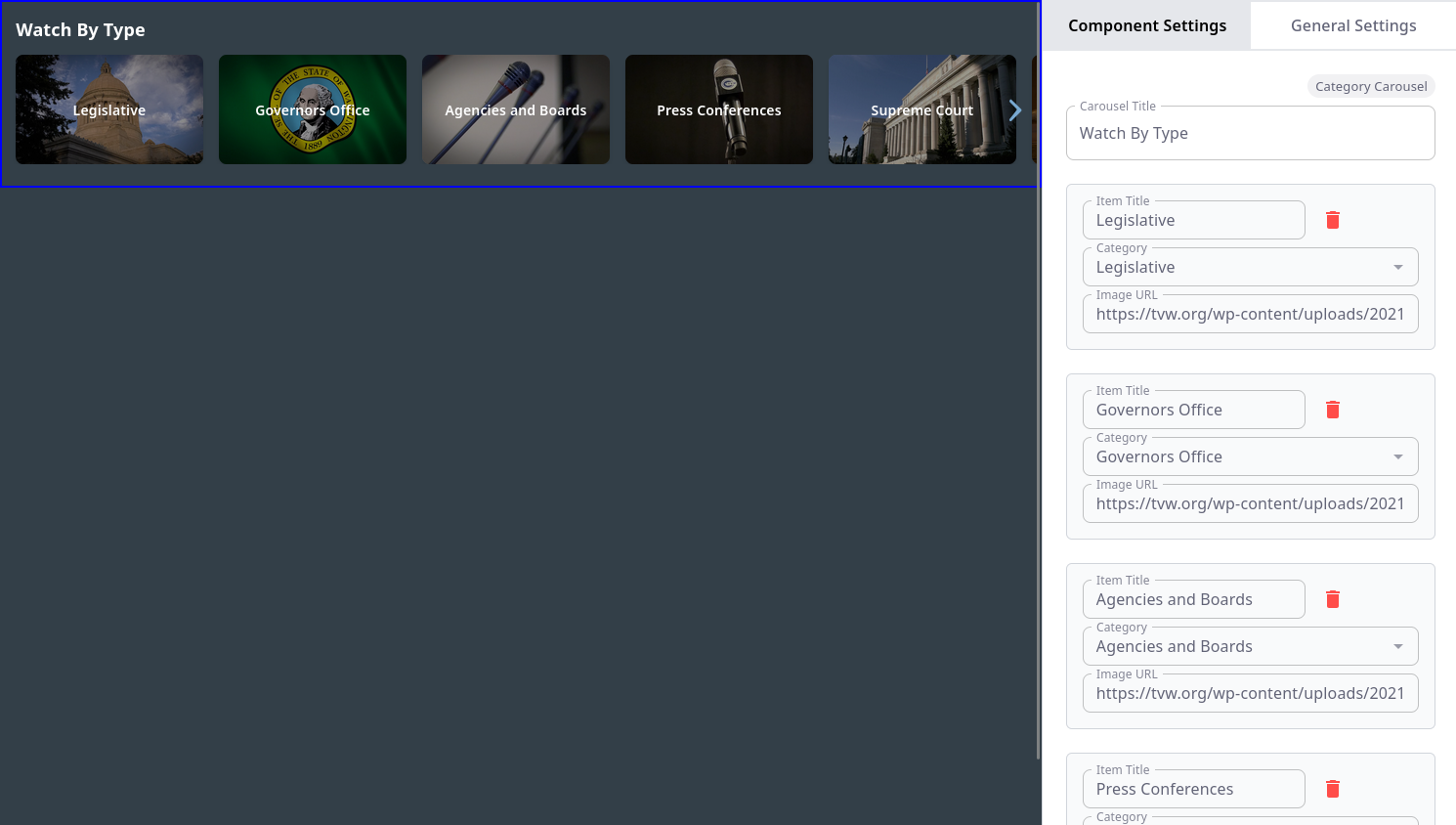
The Categories listed in the Dropdown are imported from your account throuhgh our API.
If you haven't created any (or need to edit existing ones), you can go to the Category Manager within the Control Center here:
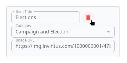
To Add a new Item to the Category Carousel, you need to:
- Enter a Title
- Select a single Category
- Find a suitable background image (preferrably in from your Global Media library from within the Control Center)
To Delete a Category from the Carousel, click on the red Trash Can icon in the Category's form field.
Portrait Carousel
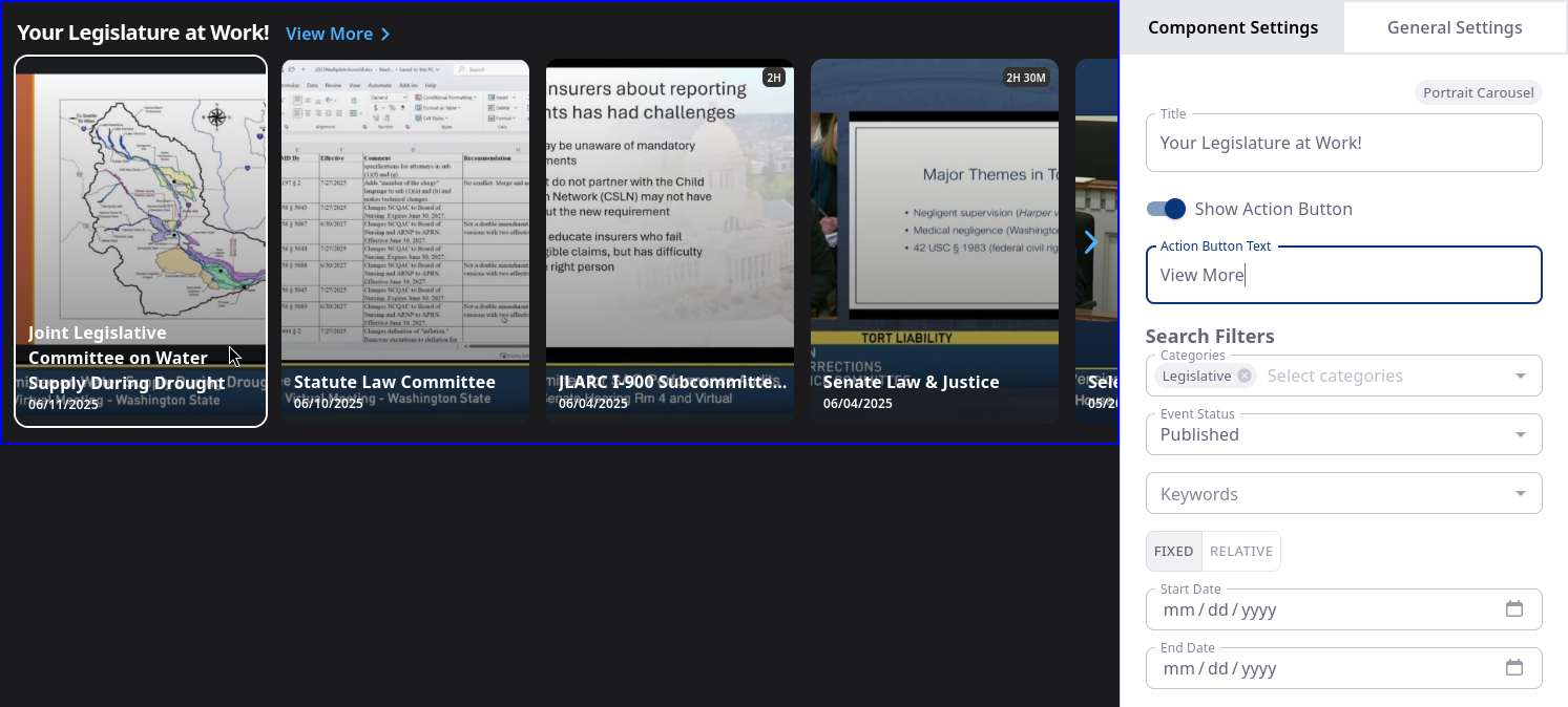
This component is used to present your Events list with a different thumbnail format - generally this is recommended for Short-form media. At its core, however, it functions much the same as the Basic Carousel with the default options: you can set Events statuses, Date ranges, and so forth.
Basic Banner
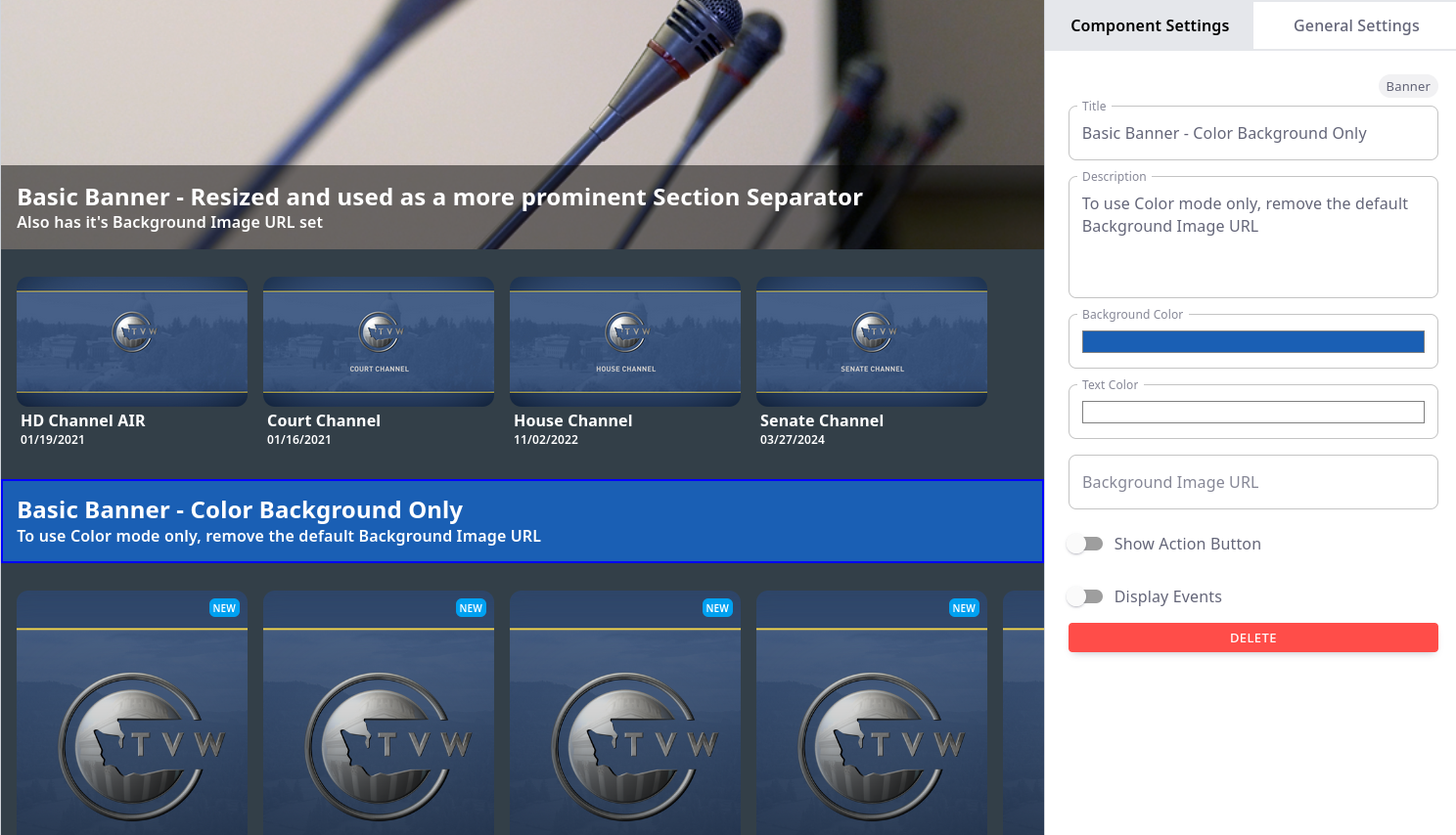
The Banner a unique component in that it has a few disctinct applications
- They can be used as section separator and/or section header
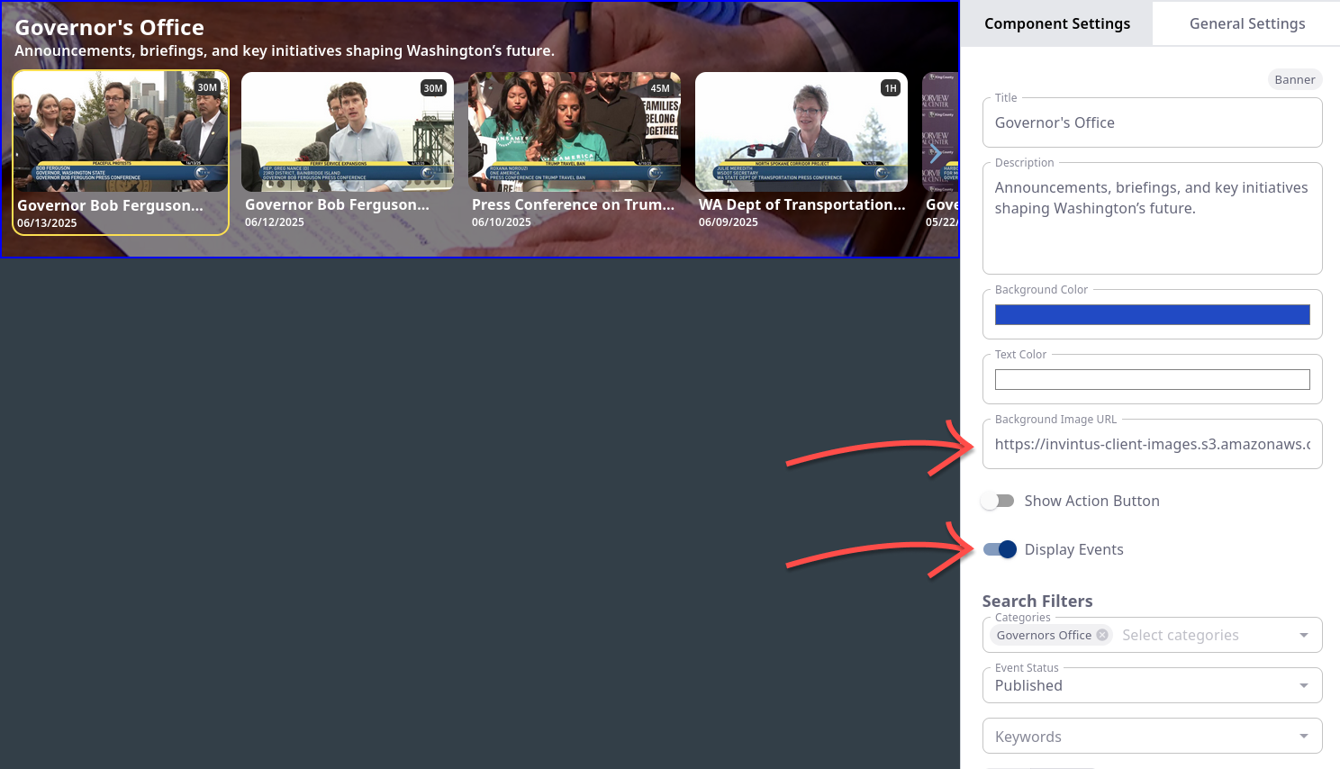
- Also supported is treating the Banner as an Event Carousel but with the added benefit of having a background image image OR a background color distinct from the one inherited from the General Settings
Banner as Section Separator / Section Header
Banner with Event Carousel and Image Background
General settings
Default Thumbnail URL
This dictates what should be used when your Event is missing a thumbnail.
- This includes Events which are Live
Allow VAST
VAST ("Video Ad Serving Template") is the technology Invintus uses to deliver Ads based upon the Ad Campgaigns you establish within the Control Center.
To manage your account's VAST Ad Campaigns, click the link below:
For documentation on creating and managing your Ad Campaigns, visit our Documentation here:
- invintus-support.freshdesk.com/support/solutions/articles/48000764277-advertising-campaign-analytics
Theme Colors
Background Color
This is the background behind all components put into the application. This does not apply when a component has a background Image or Basic Banner's Color is different.
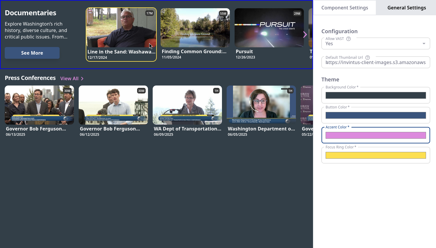
Button Color:
This this defines the background color for components with Buttons (Featured Carousel, Event Hero, Custom Hero with Action, etc).
- In the example below, it is the "See More" button on the Featured Carousel.
Excluding components with "See More" actions and the Basic Banner, the only Text color allowed is white (hex: #FFFFFF).
You must ensure that the background color and the image backgrounds you choose provide enough contrast with White text.
Accent Color:
This pertains to components which have a "See More" action (the Basic Banner and various Carousels).
- In the Example below, it is the Purple Text.
Focus Ring Color:
As users navigate across your app with their devices controllers, this color pertains to the border ring that outlines the currently selected item regardless of what component it's in.